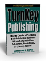
 This is a continuation of my series of rebuttals against Michael Marcus criticism of my book “TurnKey Publishing”. This rebuttal is focused on my choices of Book Interior Design. For casual readers, this may be overly technical and typically delegated out to the typesetter. For me, as a very hands-on person involved with most aspects of production, the following was my rationale.
I did hire a typesetter for my project because of her technical expertise but also to save time from my being involved with it. However, as the employer, author, and publisher of the book, I ALWAYS reserve the right to override contractor decisions. And I did so as I thought appropriate.
Full justification is a conscious choice I made. It is MY book reflecting my sensibilities and MY presentation style. I felt full justification had a “neater” and cleaner look in comparison to the margin settings.
The headers and “folio” pages in the book were INTENTIONAL. Unintended blank pages are a problem in the production process. Because of this, it is far easier to eliminate absolutely blank pages by putting a header and page number on it. Only people IN the publishing business would really care what is going on with a BLANK PAGE.
I chose NO HYPHENS because I often use phrases that require hyphens. I want those hyphenated phrases to stand alone in comparison to hyphenations “forced” by the word processor. Many people prefer to read ENTIRE words, not truncated words. And because many sentences end up having words that are truncated by hyphens, I chose to not have my words truncated at all.
My “exaggerated” indentation choice allows my readers to have more “break points” as they read, not continuous text without breaks. That is also why I don’t like to have exceptionally long sections. It is also why I like my books to have good white space and uncompressed lines.
I like using illustrative photos to break up chapters also.
Newer readers (vs. old-school readers) have less tolerance for little white space, small indents, and long paragraphs, and long sections. Subconsciously, readers want to be able to “glide” through the pages, not obsess 5 minutes per page.
Regarding the look of “mouse turds” look of a photo, chalk it up to my inexperience of photo-editing at that time. However, I was not going to hold up the book and spend $50-$100 just to clean up one photo.
Regarding the spreads and how some pages are shorter than others, that is a concern mostly for people “in the business”. Text, photos, and sections will fall where they may. Yes, there are some techniques to help alleviate orphans and other spacing issues. But at the end of the day, it was more important to me that certain sentences and paragraphs stay together for a cohesive read than to worry about a “shorter page”.
Regarding the editor, the book had an editor. Unfortunately, editors will not repeatedly and endlessly edit without a fee. And because of the timeliness of the subject matter, I chose to push forward to add and update information, not simply withhold it because I didn’t want to hire an editor for a 4th or 5th go-around.
Making availability the most current information to the reader is more important to me than any criticism of my editing or writing.
Bottom line, book formatting guidelines have changed and evolved with the advent of computer typesetting and even moreso with independent self-publishing. Trying to absolutely 100% emulate the look and feel of traditional publishers is part of the unhealthy and unnecessary mindset that discourages otherwise intelligent people from becoming published authors.
The elitist attitudes of what a book “should be” is also what discourages people from entering the publishing industry.
I stand by my statement. In TurnKey Publishing, the art form is secondary to the business side. You have to make choices about where and how much you will put your time and money to produce a book. The average reader does not care about what traditional publishers care about. They only want their information in an easy, fluid way, not taking out the ruler to measure margin, header, and footer settings. And yet, the time and expense to make these issues satisfactory for the perfectionistic traditionalists is quite real.

Be the first to comment